Monday, June 15, 2009
President Study - Inspiration
I am trying to design my main display wall not only acts as a wall, but also part of the exhibition as well which can be seen as a sculpture or an art work. I want my art gallery to be pretty dark, all the crystals will be seen with its artificial light which looks like the stars shinning in the sky.
The wall itself is the display shelf therefore the display pattern need to be considered. I did some research to find some pattern that might be useful in my case. I want to create the doors and windows as part of the pattern, together with the display frame, in order to create a sense of unity.
Display products - vary sizes
Display products and concept
I decided to display jewel in my art gallery. I choose Swarovski as my display products. Swarovski is the luxury brand name for the range of precision-cut lead crystal glass and related products by Sawrovski AG of Wattens, Austria. Swarovski design team try to produce a feeling through their design which is dream can become true. They choose to design their most products by using idea of representing nature element such as flowers, insects, and animals.
These photoes are showing Swarovski main factory in Austria
It can be seen that even the factory is designed like a fairytale world
I want to using the idea of 'Stars' to design my display area
Project 3 - site
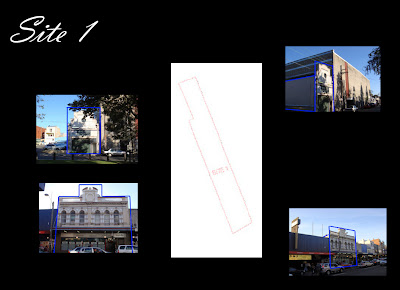
These three sites, sitting in King St, have their own unique characteristic, we have to choose one of them to create a art gallery which contains a shop, living working area for the dealer.
I finally decided to use site one. I want to take advantage of its long linear shape to create a giant wall which can acts as part of the exhibition.
Sunday, May 10, 2009
final computer model
The computer models are used to show the interior view of my design. Because I was trying to seperate the writers office by his living room and bedroom, I use different light effects such as the brightest natural lights in his office, and the darkest place for his bedroom. The models are supposed to show the light effect of all the office (semi-public area),living room (semi-private area), the bedroom (private area)
final presentation drawings
Site:
The site that I choose is at the end of Louse Rd in Sydney which is facing the sea whereas located in the centre of Sydney.
The reason I choose this site is that, the idea i want to present is a writer sitting in his office room which located in city surrounded by the people, however, he is separated and can only either feel or see people because of some physical limitations. The site allows the city buildings and also the houses behind my building, the writer is supposed to either see the people far away but can not feel or feel the sea waves facing him but can actually see anyone.
The view of the ocean also provides a good surrounding for writter. Based on my research, writters are prefer to live in or work in a place which has an comparable endless view such as sea or sky which might lead their imaginations.
Site plan:
The tones are used to show the couture lines and also indicates the location of my building
Floor plan:
I did the floor plan by highlight the shadow which emphasis the light effect due to the openings.
Section:
Because the section shows all three different areas, I was trying to indicate the function by using the different darkness
and also the landscape are drew to show the context of the house.
Additional drawings
Tuesday, April 7, 2009
analysis about the painting
The painting that I chose is the Office in a small city,1953 by Edward Hopper. The painting contains a office space which gives the sense of isolated and lonely as well. The solitary office worker in this scene is isolated both physically and emotionally. In addition, the office itself is also isolated by elevating in the air. The isolating environment can also be seen by the man's daydreaming and the man's detachment from his unseen coworkers. Besides that, the man is framed by the office windows and according to The Metropolitan Museum of Art's website, it is said that 'his head is profiled against another window and the wall of the building beyond, in a manner that suggests his containment of within his environment' In addition, there's also a contrast between the stark, utilitarian upper story and the decorative, false front at the lower right. Also, the postwar culture of American business is evident in the mass-produced furniture and the impersonal atmosphere of the office itself.
My understanding:
The person in the office is separated because of the height of his office building. He can either see the people when he goes down or he can feel them when he's in his office.
My narrative:
A city house makes a writer to be separated because of physical limitations which performs in the way that he can either see the people in distance or feel the surroundings.
Saturday, April 4, 2009
Working process 5
Circulation
In the plan, I drew the circulation by analysing the most activity area
Eileen Gray likes to play with the openings when she design a building. The similarity can be seen from the two buildings from her selected this time. She likes to design a room with many entry and exits. For example, the building i am doing has four entry. And she also created lots of options when walking into the building.
So I drew the circulation to show the options that mostly made by the guesses
(That's why I did not draw the line in Eileen Gary's private bedroom)
For the section, I did vertical internal circulation
She created several level changes within the building (four one-step height difference are designed within the building) and also the stairs connect exterior and interior, and the storage room hiding below the main level.
Working process 4
Structure drawings are done by analysing the grid
Eileen Gray tried to hide her load-bearing columns in the walls so that the columns become invisible. She finally cut down the number of visible columns into two.
I drew the walls in dot lines, indicated the invisible columns in dot lines (square shape)
and the two visible columns in black (round shape) to show the difference
Working process 3
Eileen Gray is somehow influenced by the Le Cobusier, she set the grids when she design the buildings. So I tried to figure out the proportion that she hide in her design.
Geometry drawings indicate the proportion that I found hiding behind her design
In the plan, the black lines illustrated the building divided by functions while the red lines are the proportion that I found.
Especially in the section, the proportion that I found is quite obviously.
The red lines indicate the proportion
The largest rectangular is three times as large as the smallest one
while the middle one is twice as large as the smallest one
working process 2
views can be analysed by understanding the openings. for example, the way people can physically walk through or just look through openings or the view is blocked by some particular elements, all of these can help understanding the building.
Program drawings were done by analysing the building openings.
working process 1
The building is built by Eileen Gray for herself. she bought three small areas which contain three water tanks. She was sort of designing a building on the existing building. She changed two of water tanks into one base room and one guess room. Because the building is for herself to live, she designed the space based on her own habit and create some distinctive characteristics such as the use of the site, build-in furniture and also light control.
Furniture and light control can be seen in the Proche drawings
The Proche drawings indicated the final effect provided by the building.
Furniture and light control can be seen in the Proche drawings
The Proche drawings indicated the final effect provided by the building.
Tuesday, March 24, 2009
Tuesday, March 10, 2009
Research 3
My project building is Tempe a Pailla, Castellar by Eileen Gray
The Tempe a Pailla is a house for Eileen Gray herself.
She bought the land and design her own house.
She created a dramatic dialogue between the house and its site.
She built the new house on the top of the old one, however, create a flawless transition.
The interesting design point is the way she treated the relationship between exterior and interior.
The links that I found between internal and external are the same shutters, the same light fixtures, the same treatment of the floor and walls for the rooms and the terrace.
Subscribe to:
Posts (Atom)